

What’s up everyone, thank you for all the love/hate/feedback on my last post! If you missed it don’t worry, you can check it out right here.
Next up on the Logo BreakDown are the Tampa Bay Rowdies of the USL League One or Two or Campeones, idk something like what other leagues are doing. I resorted to having another twitter convo (mostly with myself) on what team I should pick next. Being that I live in Tampa and I follow a couple accounts, the Rowdies come up on my timeline quite often. I have always been drawn to the Rowdies logo, because it’s another unique logo like the Chicago Fire. The bright colors reel me in and the weird style of the type(font), but the thing that drives me crazy is the absence of a shield! Working with multiple logos at a time makes it a bit tough with you always have one logo that looks nothing like the rest. So after reaching out to the Rowdies twitter community, I decided to choose the Rowdies as my next project.

I got some really good feedback in terms of things I should stay away from, things to keep and what everyone liked. From the start I knew I wasn’t going to mess with the typography, it is too special and quite complicated to break up and rearrange. So when Twitter said not to mess with it, I was in agreement.
A couple of them put their own mockups together, you can check that out here, so that too was good for me to check out and see what had already been done. All in all, it generated a good discussion and something for me to build my ideas from. One thing that stuck with me was a comment by @KodyAllenson about the word mark being imperfectly perfect. Gave me a little bit of an idea but I was unsure if I’d be able to accomplish the look.

quote by twitter user @KodyAllenson Check the thread here
This was also my first post following the new schedule I’m doing of one “rebrand” every two weeks. Gives me some time to really think and have some fun with it, plus with a 3-month old right now it’s a bit tough to get things done. So I started off with the normal doodling and researching/taking down notes. Whenever I had some time I would check out some info on the team, see if I could somehow create something from it.

Page out of my sketch-book of my notes and sketches on the new logo
So my plan as you can see in the photo above, was to somehow intertwine or get the letters TBR to work together. Mike Pendleton (@phat7deuce) did something of the sort, he was in the previous mention about the crest mania by the Rowdies fan community. I wanted to take it one step further and maybe a little bit more. I wanted to do the TBR but base it on the original word mark. I felt I had enough knowledge in the letters ROWDIES to create a T and B following the same style. My objectives for this project was to:
Keep typeface/font style
Introduce badge
Introduce additional element

The goal was to create a TB with the same style as the R and also so that they fit together as a monogram.
You might say, why don’t you just use the T and B in TAMPA BAY atop of the logo. Well it’s in a different type style and I wanted to keep the original look. So for the first time in a long time I used my iPad, I have been neglecting it and needed to use it. I will add though, I did sketch a bit in my book before going to my iPad. Once I got the lettering to where I liked it, I then brought it into Illustrator on the computer and began cleaning it up.
Also one thing I did right from the start was eliminate the two stars, I’m sorry but putting a star above the badge is stupid. You don’t see Real Madrid, Barcelona or Manchester United with 10+ stars around their badges. It simply does not make any sense, not to mention the Rowdies won the championships in a different league. Sorry if that upsets the fans, but it’s just not needed in my opinion.

From iPad to computer clean-up.
Once I had the letters laid out, I was able to decide on the type of shield I need. I wanted the T to be the most prominent, so I raised it above the other two. As a result, the logo was now going to be a bit tall since I was planning on adding an element at the bottom of the shield, below the text. So I started working on that bit instead. As soon as I had the extra element plus the text, a clearer idea of what shield would work best started to devlop. I had been meaning to introduce the whole pirate history that is in Tampa Bay; there’s the Tampa Bay Buccaneers, Gasparilla Festival and a Pirate Invasion that the whole city participates, even the mayor! I felt this would be a lot of fun and something that I haven’t seen the team really capitalize on, considering they play right on the water. Not wanting to give that piece away, take a look below on how I started to develop the final shield design.

Knowing I had a tall design as my focus, I needed to work on a more vertical style badge.
I really liked the tall narrow look but I wanted to add something to the top to differentiate it from other similar style badges. I had to eliminate any use of “hoops” or stripes because it would make the TBR too hard to read. As much as I wanted to use them, I couldn’t get them to work. I mean you can make them small like pinstripes but this logo will be small, so you would lose those tiny details. Working from the whole pirate theme, I added a bump like the top of a pirate’s hat. Check out the final design below!

Full color badge alternate of the Tampa Bay Rowdies.
Rowdies fans, are you done screaming yet? Ha, I just like saying that, but here is my design. Working off of the existing typography, I was able to create a similar styled T and B to fit with the Rowdies R. I added a border to the text as well as introduced a darker green to further bolden the letters. Even though they play in St. Petersburg, I wanted to keep the Tampa Bay still in the badge and not go to St. Petersburg Rowdies, that’s just weird. I felt the boat steering wheel and the top of the badge were simple and relatable additions. I never knew how big it was until I lived in Tampa, people go crazy for Gasparilla and the whole Pirate history in Tampa Bay. See the breakdown below.

Here a quick breakdown of each element.
In the end I’m pretty happy with how it came out. It still has that nostalgia in it as well as history. I didn’t want to completely eliminate the old font but it was very limiting to use the entire word mark. What do you think?
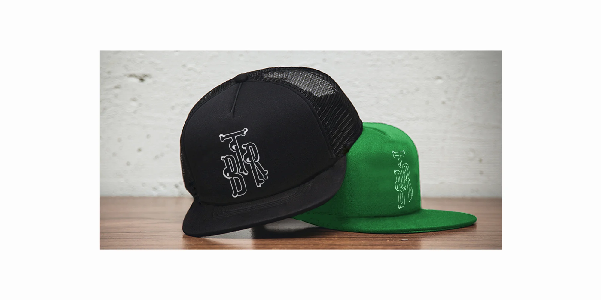
Check out the rest of the branding below, along with some other fun ideas for a Tampa Bay Rowdies rebrand. Follow me on Twitter and let me know your thoughts and give me your ideas for my Fan’s Choice Kit mockup!


Home Kit throwback
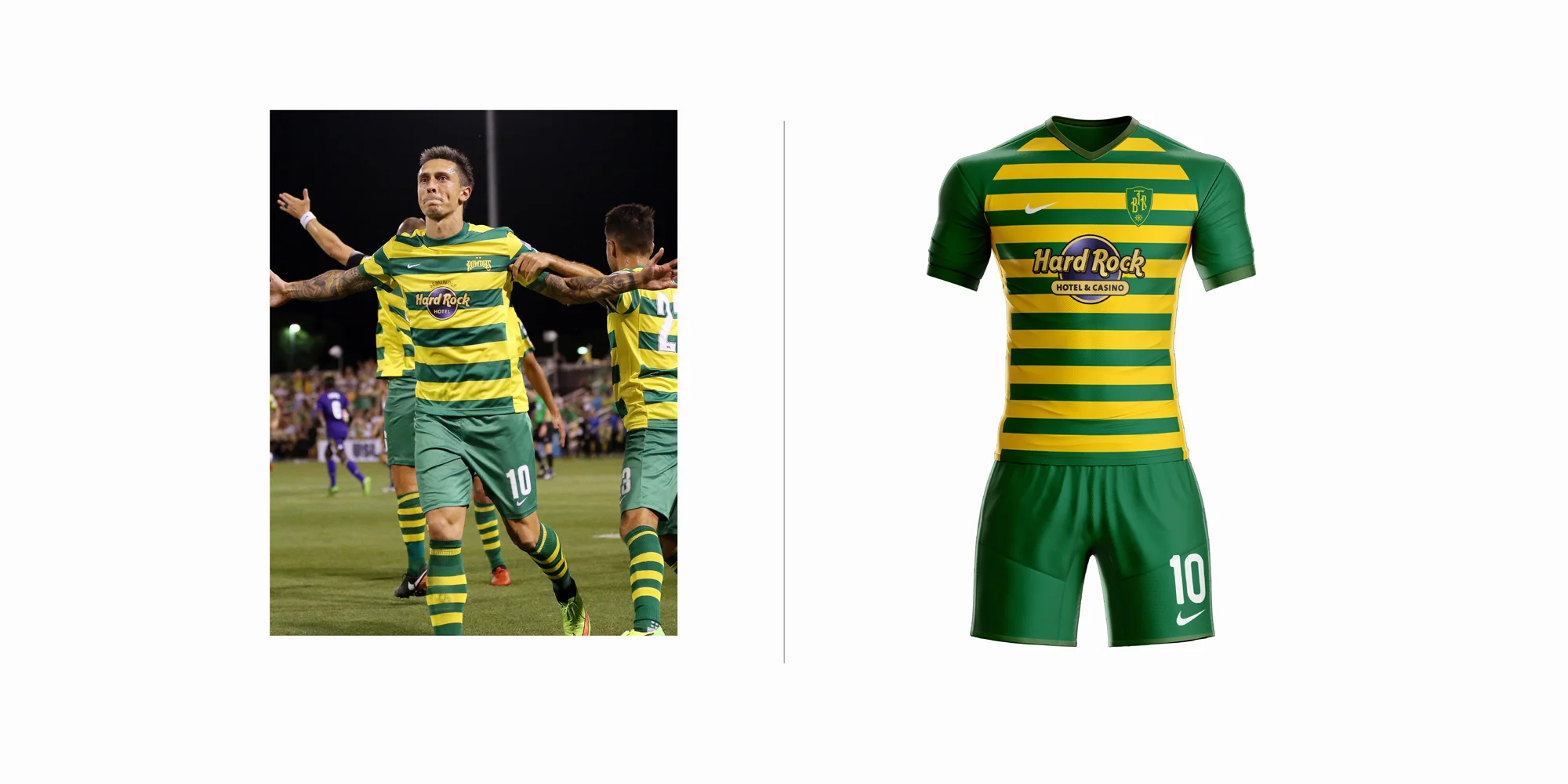
My take on a recent kit, which do you prefer, adidas or nike?

Home | Away | Alternate
Check back later for
a FAN’S CHOICE ALTERNATE KIT!
Have thoughts on my rebrand? Would you be in favor of the Tampa Bay Rowdies adopting a shield logo? Leave a comment below!
Make sure you follow me on twitter/instagram for new posts! @designbyalva
Tweet me what team to do next!