

Dear Chicago Fire fans, take a deep breath, this isn’t real.
Ok! Now that we got that out of the way, The Logo BreakDown is back! After more than a year off, I’m excited to get back into it. Next up, Chicago Fire of Major League Soccer (MLS), the team from my home-state! So let’s get right into it, I am not entirely fond of the Chicago Fire shield, for me it lacks something. Seeing as Chicago Fire is one of the last remaining teams to rebrand, I felt this would be a fun little project. Going into this, I knew the biggest obstacle would be changing the shield. I decided to reach out to a loyal Chicago Fire fan for his thoughts. (btw you can follow him on twitter here! @CF97ScarfTrades)
I normally don’t show my work/design to anyone until it’s finished, but since I was taking my time with this rebrand, I wanted to get some feedback. After showing him my first draft, his response was, “The thing is I'm already a huge fan of our current logos so I'd be devastated if they re-branded. I honestly think it's one of the best, most unique and most timeless crests in the league.” Well, crap. BUT this is something I already knew would happen and was ready to take the criticism. Remember when Juventus rebranded? Everyone lost their minds. Now? I don’t think anyone can say anything over the sounds of them raking in the money from all the new merchandise.

In terms of originality, it is unique. Paired with the lame ‘C’ in the middle and typical arc Chicago Fire, it just doesn’t do it for me. That’s why I have the creativity at 6, it’s just lacking something to compliment it’s shape. Keep in mind, they were founded in 1997, just a couple of years after Photoshop was introduced to the world. So the badge has a ‘want to be futuristic but still seems old’ look, in my opinion. Breath you guys, breath. As for the color scheme, there’s nothing on their website about official colors. There is a description of the logo(if you want to read that, click here.) but it doesn’t include anything about colors. Now on their Wikipedia page it states that the official colors were white and red, but overtime the Fire used navy blue, sky blue and black as alternate colors(read about that here). I am a huge fan of grey, light grey, dark grey, any grey for that matter, but not with this color scheme. It seems to dull the entire color scheme and give it a drab look.

I have to point this out, on the Fire’s page about their logo, it reads that they, “wanted something with energy, something with punch and that flows,” but then follow it with "the ‘C’ in the middle was a more conservative look that will stand the test of time.” Ha what?!
Overall I give this logo a 6 out of 10, simply because it lacks a color scheme that complements the badge design. Also the ‘C’ lacks punch for me. According to their narrative the six points around the circle represent the four six-pointed stars in the “City of Chicago” flag, but they don’t mention anything about the point added on the ‘C’ in the middle.
Without pissing off too many fans, my objectives for this project was to:
Eliminate badge
Introduce new element
Tweak color scheme
I was excited to get started, mainly because I had an idea in mind already and two weeks to work on this. My idea was to do something similar to LAFC, work with the initials of Chicago Fire. In this case, the ‘C’ and ‘F’. I started sketching and doodling in my notebook, as well as taking some notes about the Fire and it’s history. I couldn’t decide if I wanted something bold, serif, sans-serif, tall and skinny, short and fat. In other words it wasn’t working and I wasn’t liking it.
page of my sketches, trying to figure out what type of CF I like and what shield works best with it.
I was trying to stay away from intertwining the two letters, I felt that NYCFC already killed that. So butting them up next to each other was what I was working with but slowly failing. But as I was developing the ‘CF’ and the shield, I came up with other elements I wanted to add to the design. I knew I wanted to pay a tribute to the old badge in one way or another, though it wasn’t until I started messing around with a shield that I figured it out. At first it started with an outline of the badge at the bottom of the new shield with ‘97’ for its founding year. Once again, unable to come up with a style for the ‘CF’, I ended up killing the ‘97’ but gave light to a new idea, the six-pointed star. So rather than not include the old badge, I was able to come up with a combination that pays tribute to the old badge but also the four six-pointed stars on the City of Chicago flag.
As a way to procrastinate from working on the CF element of the badge, I worked on this support element that will go towards the bottom.
Now that I got the tribute to the old design out of the way, I started to work on the text. I was set on going with a serif typeface, I just wasn’t sure exactly what one. I tried to find something like the original ‘CF’ sketches I did. In comes the typeface, Ngopi Doken, I liked it a lot, however the serifs were angled, so I went in and cleaned up each letter a bit.

As you can see, I went in and straightened out all the angled serifs.
Done, now I just need to get my butt back to working on the main element of the logo. The most important part, the ‘CF’. After several attempts on the computer, I just wasn’t feeling it and needed to move onto something else. Luckily I had something else in mind to work with. Let’s go back to the image of my sketches, I cropped it, see what I left cropped out below . . .
The fireman axe was something that I wanted to add as another supporting element, but instead I decided to make it my main focus.
The fireman axe. There was something there. I could feel it, as I was sketching and reworking different versions of it, I knew I was close. After some fine tuning and getting some advice from my bud @benmcnultydesign I finally ironed out my design. I decided I wanted to feature two fireman axes, crossed in the middle. Have the six-pointed star/old badge homage at the bottom and across the top, feature the team name Chicago Fire.

Here is the full color version, paired with logo in it’s one color treatments.
Chicago Fire fans, are you done screaming yet? This is what I came up with, a clean, sleek, bold and simplified take on combining firefighting and soccer. Remembering the Great Chicago Fire of 1871, I wanted to put the focus back on the history of the city. Originally when I started working on the axes, I put too much thought into it. It tends to happen when I take time off designing with a minimalist style. Once I got that to where I liked it, everything else just seemed to fall into place like a puzzle.
Here a quick breakdown of each element.
I’m very happy with the turn out, I think it’s something bold and clean. It still has it’s history in terms of the Great Chicago Fire and the use of the old badge as a supporting element. What do you think?
Check out the rest of the branding below, along with some other fun ideas for a Chicago Fire rebrand. Shout out to @CF97ScarfTrades for the firefighter inspired third kit!

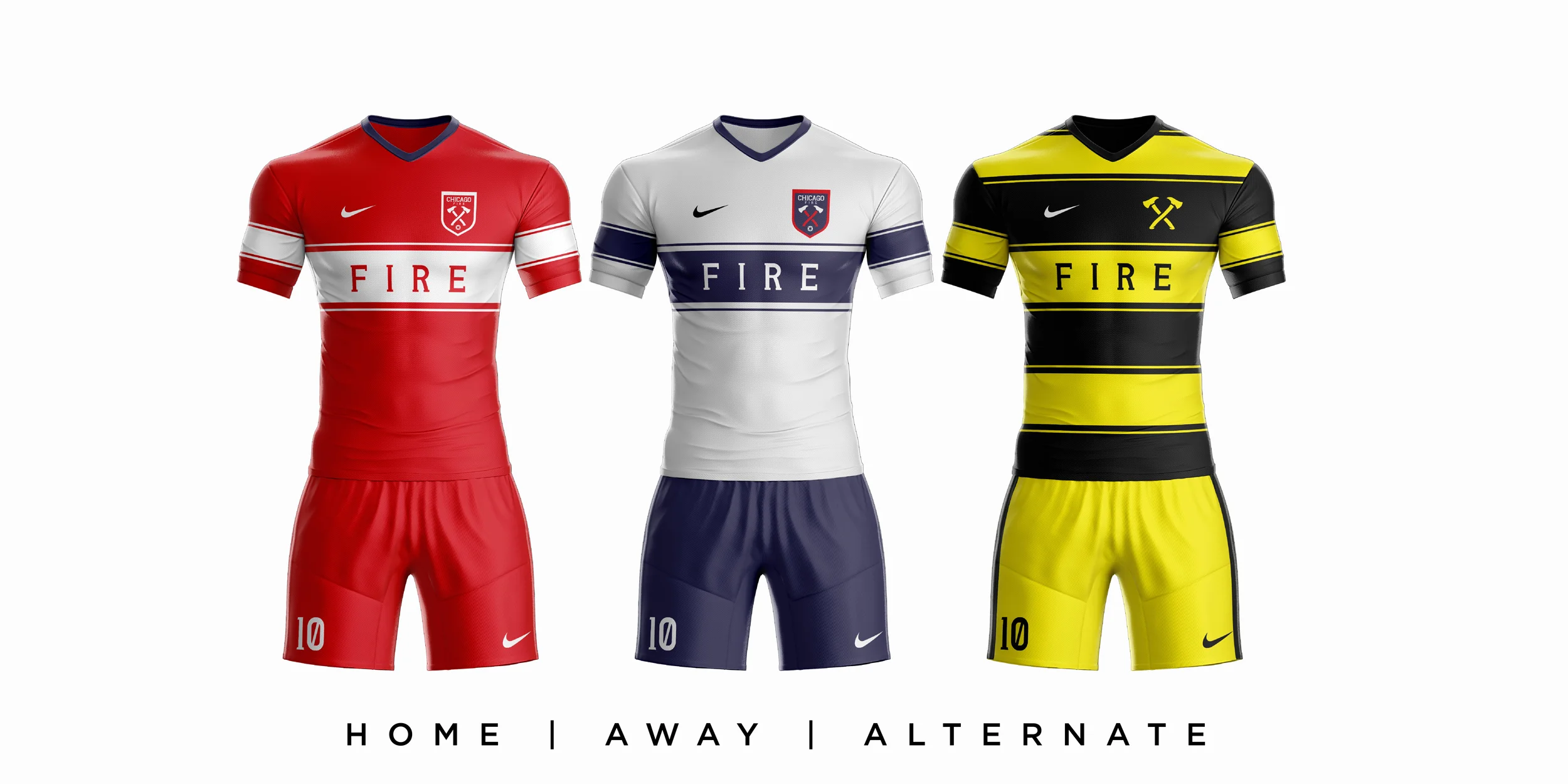


STAY TUNED FOR A REVISED ALTERNATE KIT AND A SPECIAL FAN’S CHOICE ALTERNATE KIT!


Have thoughts on my rebrand? Would you be in favor of the Chicago Fire rebranding? Leave a comment below!
Make sure you follow me on twitter/instagram for new posts! @designbyalva
Tweet me what team to do next!