

Man, this was tough but I sure had some fun doing it. As I mentioned on Monday with the Bottom Five announcement, apart from reviewing each logo, I will also attempt to revamp each logo. Thinking it wouldn't be that hard to turn around a full brand in two days, but I love challenges. Make sure you let me know your thoughts on my re-brand! Let's get started, take a look below at how I started to work on Real Salt Lake's logo.
If you don't know much about Real Salt Lake you can take a look at this video done by the MLS that talks about how they got their name and colors. But if you want a quick run-down here it is.
- Then owner Dave Checketts was impressed and looked up to Real Madrid in both presentation and management
- Given blessing by Real Madrid to use REAL in their name, DESPITE using Real Madrid's rival colors.

In Monday's post, I ranked Real Salt Lake as the bottom 5 logos in the MLS. View here
and so it begins.... research and brain-storming time!
Off to my favorite coffee shop here in Tampa, Buddy Brew Coffee.

I hate sketching. It's one of my least favorite things to do, as well as to share. My drawing skills are sub-par but the main reason I hate it is because I get impatient and want to take my work straight to the computer. Which spoiler alert, I did have something just like that occur during this project.
I wanted to do some research, and easily enough I found a couple interesting things on Real Salt Lake. What stood out to me the most was that they were allowed to use the Real name, a power-house name in soccer today, along with their biggest rivals colors. It just baffled me! How?! Why?! Well turns out then owner, Dave Checketts was pretty much in awe of Real Madrid and wanted to model his franchise as such.
After learning about that, I knew what I was going to do. I was going to take Real Salt Lake back. Back to the reason why their name is so important. At the beginning they were the sister club of Real Madrid, Spanish soccer royalty, so I wanted to take Checkett's original plan and modify it. Meaning the biggest change is the color scheme, going from red, gold and blue to blue, white and gold. Big changes were in the think tank, but I felt that it was important to keep the shield shape.
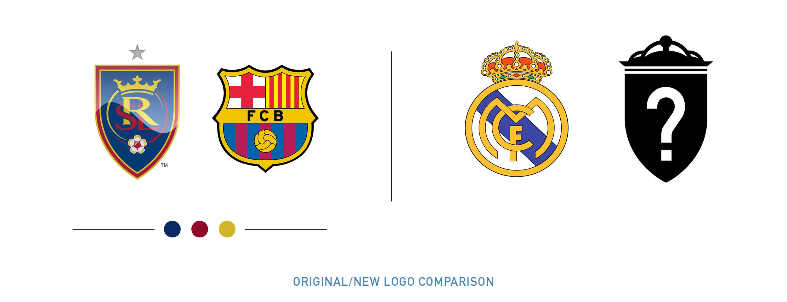
Now for the elements, Real Madrid has a prominent royal crown but it had far too much going on. I needed to strip it down and modernize it. At the beginning my ideas and sketches were really promising, but I felt that it might be a bit too straight edged and didn't fit the look. I continued anyways and well, how did it go? Horribly.
My sketch ended up looking like Batman's ninja stars. So I scrapped my idea and decided to take the original royal crown. I had to get rid of the unimportant jewels and details that would be lost when the logo is small. Now here is where I messed up, I thought Real Salt Lake had won a championship. WRONG. They won an MLS Cup, so after finishing my WHOLE branding I realized this and had to modify everything. Cup stars should not be added to a logo, could you imagine if Real Madrid added all of their stars? It would be endless. Therefore I removed it.

I started getting frustrated with the crown. Because there was so much detail it turned out to be a case of eliminate this and see if your object is still recognizable. Finally after some time, I settled on a crown that I was satisfied with. Yes, at first I had a star, but removed it once I realized my mistake. Though by doing so, I think the crown works even better as the star was a bit distracting.

Next was the inside of the shield, which then ended up being my next obstacle course to tackle. I did not like that the R was bigger than SL. It felt as if a foreign club was more important than the city itself. So my focus was to bring it back to Salt Lake city and leave the association to Real Madrid be done by colors and elements, not by name. After trying to decide if I should go with a modern, stylish or serif fonts for the letters, I landed on Cochin, a very strong serif font. I decided that I would use that as the main RSL letters on the shield. From there I worked on layout, how was I going to lay these out so that the S was prominent but not leave R and L behind. It proved to be quite difficult but I think it worked out well.

The shield I felt wasn't original but I didn't really matter. I wanted my logo to focus on its overall aesthetic and not just be based on the shape of its container. I did however want to eliminate one or two of the borders, they just seemed a bit unnecessary.
Remember how I said I'm against the use of a soccer ball in your logo, especially if it's generic? In this case, Real Salt Lake has an awesome soccer ball design at the bottom of their shield. It combines the simplicity of today's minimalism with a royal antique feel and gives us a great soccer ball. I had to keep it.
Take a look below at the full re-brand and let me know your thoughts!
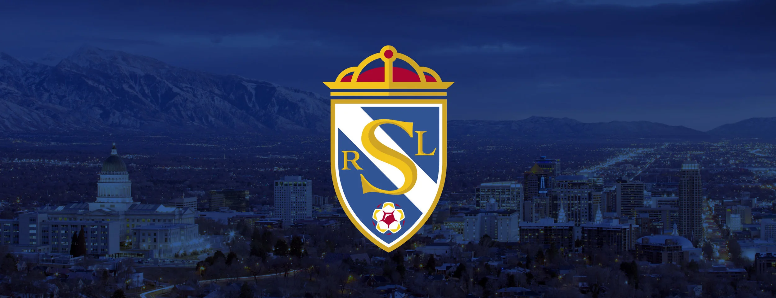
My interpretation of Real Salt Lake based off the colors of their sister club, Real Madrid.

When Real Salt Lake's logo was created, it was done so with the colors of Real Madrid's biggest rival, FC Barcelona.

Check out my breakdown.
Want to see the full branding? Click below!
Are you a PDL, NPSL, USL, NASL, or amateur league soccer team in need of a logo? Contact me!
Want to know how I rate these logos? Here's a little breakdown:
Originality- What makes the logo its own? Does it stand out among the rest, or blend in?
Creativity- Is there that special thing that makes it stand out? What sets it apart from the others in a special way?
Color Scheme- I'm looking for 1-3 colors, maybe four, at the very most five, if they're used well.
Agree? Don't agree? Leave a reply!