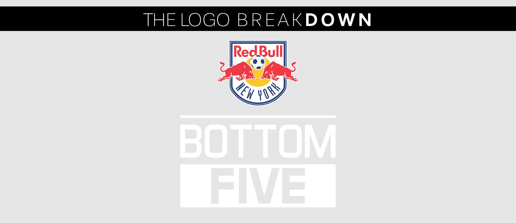
I'm back! With my fiancé's birthday on Monday and a wedding in a month, things are getting pretty hectic. BUT! I put extra work into this New York Red Bull re-brand for you guys. In fact, I had a quite an interesting journey working on this re-brand attempt. For instance, did you know the New York Red Bulls were, in fact, the New York/New Jersey MetroStars? No? Neither did I. With the addition of NYCFC, I felt that we should take this logo back to the beginning and set it apart from its "rivals". Keeping this clean design look going, I decided to strip New York from its energy drink sponsor, Red Bull.
See the development below of #3 on the Bottom Five; and as always, let me know your thoughts!
After doing very limited research, I discovered a following of MetroStars fans who keep the MetroStars name alive. Now if you didn't know, there was a huge controversy about the MetroStars selling out to Red Bull. I mean if my home team completely re-branded to match an energy drink, I'd be pissed too! Where's the history?! Gone! This happened back in 2006, it was such a big deal that fans even bought ad space demanding Red Bull abandon their investment.
Which brings me to my objectives for this logo:
- Make MetroStars fans proud
- Simplify and combine MetroStars and NYRB logo
- Eliminate bulls and set focus back on star element
Excited as hell to work on this project, I spent the next couple rainy days researching the beginning of New York Red Bulls.
In last week's post, I ranked New York Red Bulls as #3 in the bottom 5 logos in the MLS. View here
Remember how I said I have a tendency to be impatient and take my sketches right to the computer? Well here is an example; very basic. BUT! I had a pretty good idea what I was going to do from the beginning
After reading about the MetroStars, I was 90% sure what I wanted to do and how I wanted to approach this logo. Keeping with the clean simple design, I decided to combine the MetroStars original branding with the New York Red Bulls branding. There were some major changes I wanted to make right from the beginning. GET RID OF THE RED BULLS.
I'm sorry, it's just a very dumb brand for a club. Not to mention, they're actually called Red Bull New York, but are referred to as New York Red Bulls (even though the logo says Bull). So you see what I'm talking about in terms of trying to keep a consistent brand?
The change was dramatic and seemed like a tough task to merge these two together. Though as I delved deeper and deeper into the beginning of MLS, I discovered a ton of retro design style. Using that with my simple design approach, I was finally ready to get started.
A breakdown of what I decided to keep from both clubs branding.
Blue is everywhere in the MLS, therefore I eliminated it from the color scheme. I kept the red and black from the MetroStars brand and the gold from the NYRB brand. The shield designs are very different from one another, but I felt like the NYRB shield would work best for my idea.
Taking New York Red Bulls to the beginning and putting the focus back on what makes the team, not a sponsor.
Rather than compete with NYCFC with having New York in its name, I eliminated it from the badge. It's not needed.
While checking out all the history involved with this team, I came across some great old school jerseys. That's what ended up solidifying my idea for this logo. I wanted to give it a simple retro look, something that focus' on the star element.
I started by cleaning up the NYRB original shield, removed the random legs of the bulls that were hanging off the edge. Inverted the original star, from white with a yellow outline to gold with a white outline. I wanted to include some other elements from the NYRB branding but all I really could have added was the gold circle, but it just wasn't working.
One color treatment.
I took this project a step further! As I mentioned before, I was really intrigued with the old school jerseys I came across. In fact, the MLS All-Stars wore a throwback jersey for the All-star match against Real Madrid this year. So I spent a little bit extra time developing some jerseys. TAKE A LOOK BELOW!
So who wants one?
Thanks for reading! Be sure to look out
for my next part of #BottomFive
Are you a PDL, NPSL, USL, NASL, or amateur league soccer team in need of a logo? Contact me!
Want to know how I rate these logos? Here's a little breakdown:
Originality- What makes the logo its own? Does it stand out among the rest, or blend in?
Creativity- Is there that special thing that makes it stand out? What sets it apart from the others in a special way?
Color Scheme- I'm looking for 1-3 colors, maybe four, at the very most five, if they're used well.
Agree? Don't agree? Leave a reply!


